Beige & Cream Aesthetic Folder Icons for Mac & Windows (2026)
The best beige, cream and neutral folder icons for Mac and Windows in 2026 — ivory, taupe and warm-texture sets, hand-picked. With a 60-second install guide and FAQ.
Beige is the palette people land on when they are tired of noise. It is the desktop equivalent of a linen shirt: nothing shouts, everything matches, and the eye finally gets somewhere to rest. The one thing that usually ruins it is the folders — a row of saturated system blue sitting in the middle of a carefully neutral setup, undoing the whole mood.
This is our hand-picked roundup of the best beige and cream folder icons for 2026 — from clean ivory to warm taupe and soft textured neutrals. Every set is a complete, matching pack with .icns files for Mac and .ico/.png for Windows, so the calm palette carries across your whole desktop.
What makes a beige folder icon set look good
Neutral is the hardest palette to get right, because there is no bright colour to hide behind. The sets that actually work share three things:
- Warmth, not greyness. Good beige leans to cream, sand or oat. The moment a neutral drifts cold it stops reading as beige and starts reading as an unfinished grey placeholder.
- Texture instead of colour. With the colour turned down, the interest has to come from somewhere else — quilting, paper grain, leather, a small charm — otherwise the folders look flat and empty.
- Enough contrast to stay usable. The best neutral sets keep a slightly deeper shade or a small motif on each folder, so you can still tell them apart at a glance instead of facing a wall of identical cream squares.
Best ivory & cream sets
For the clean, gallery-quiet end of the palette:
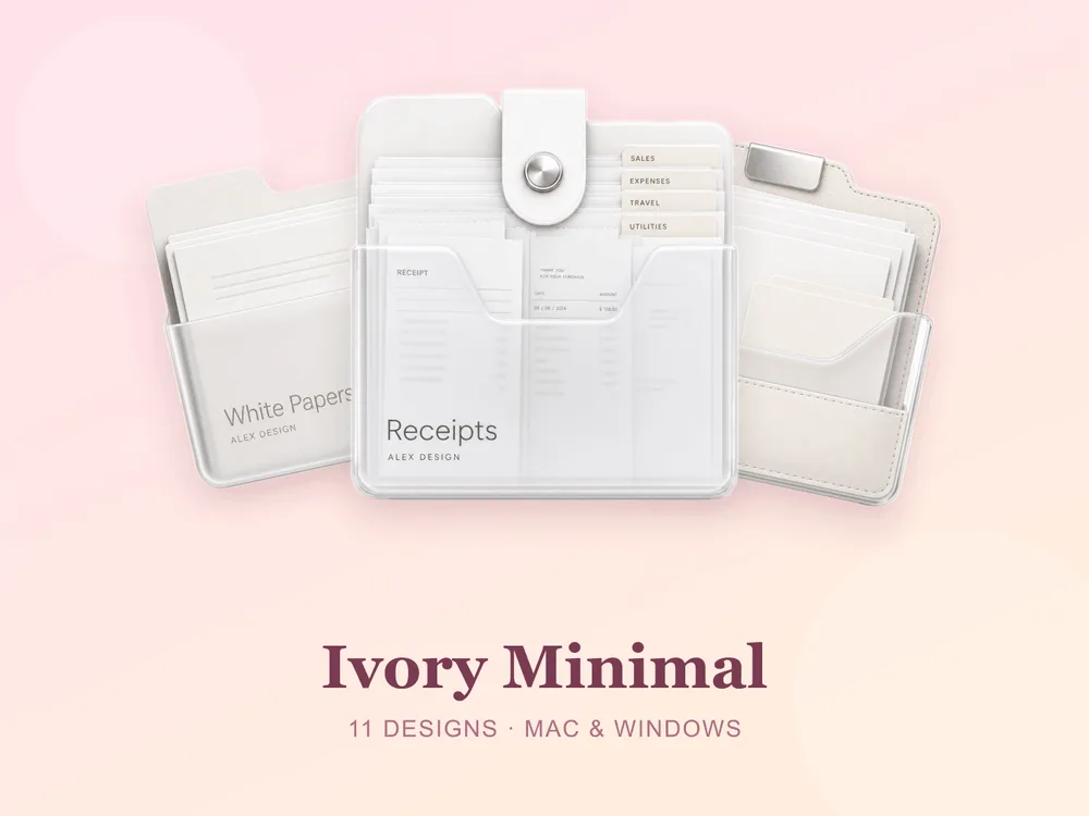
- Ivory Minimal — clean off-white folders with nothing extra; calm, precise and endlessly easy to look at.
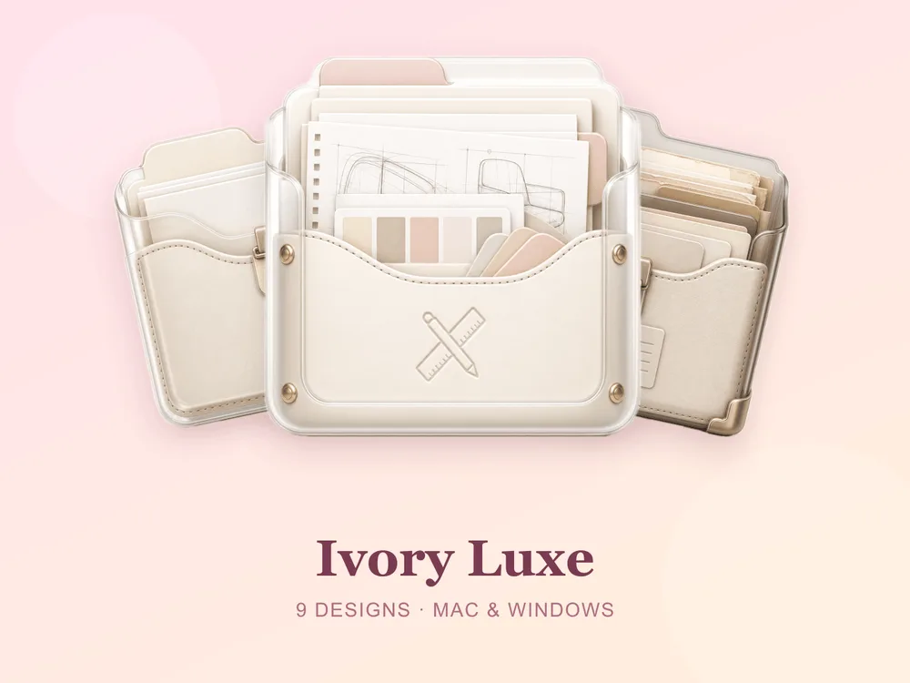
- Ivory Luxe — quilted ivory with a soft padded finish; understated, expensive-looking and beautifully tactile.
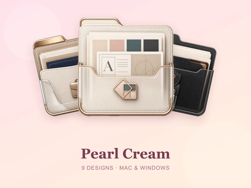
- Pearl Cream — pearly cream folders with dainty little charms; gentle, feminine and quietly polished.
Best warm neutral & taupe sets
For the sandy, earthier end — the one that pairs with a wood-tone wallpaper:
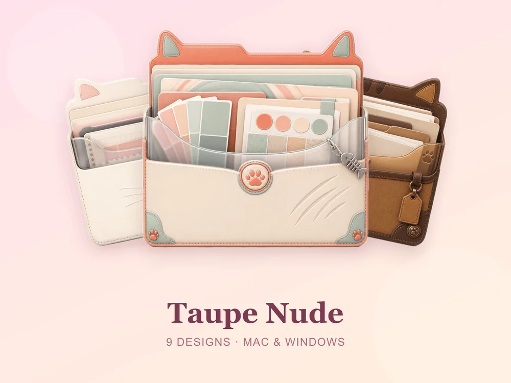
- Taupe Nude — soft taupe and nude tones; grown-up, muted and effortlessly cohesive.
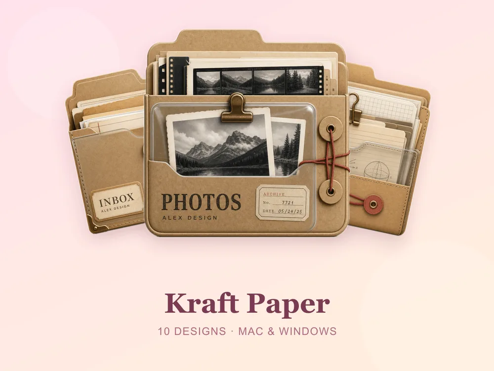
- Kraft Paper — warm kraft paper with a recycled-stationery feel; honest, crafty and pleasantly plain.
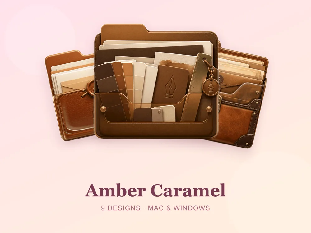
- Amber Caramel — warm amber and caramel folders; richer than plain beige, still completely neutral.
Best soft-texture neutral sets
For neutrals with a little more personality:
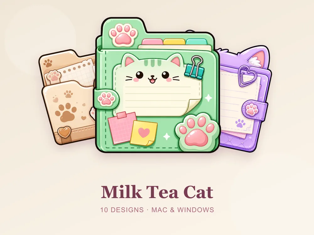
- Milk Tea Cat — a beige kitty with soft paw prints and little notes; neutral, but with a gentle journal-style charm.
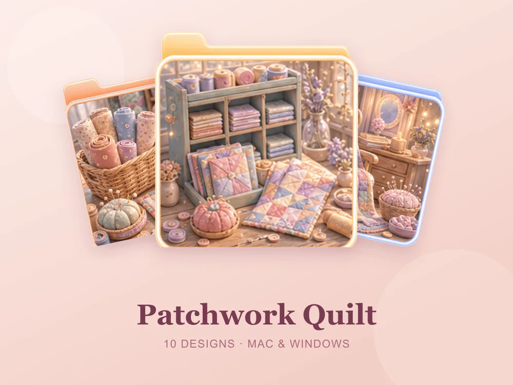
- Patchwork Quilt — soft stitched squares and handmade warmth; cozy, tactile and comfortingly imperfect.
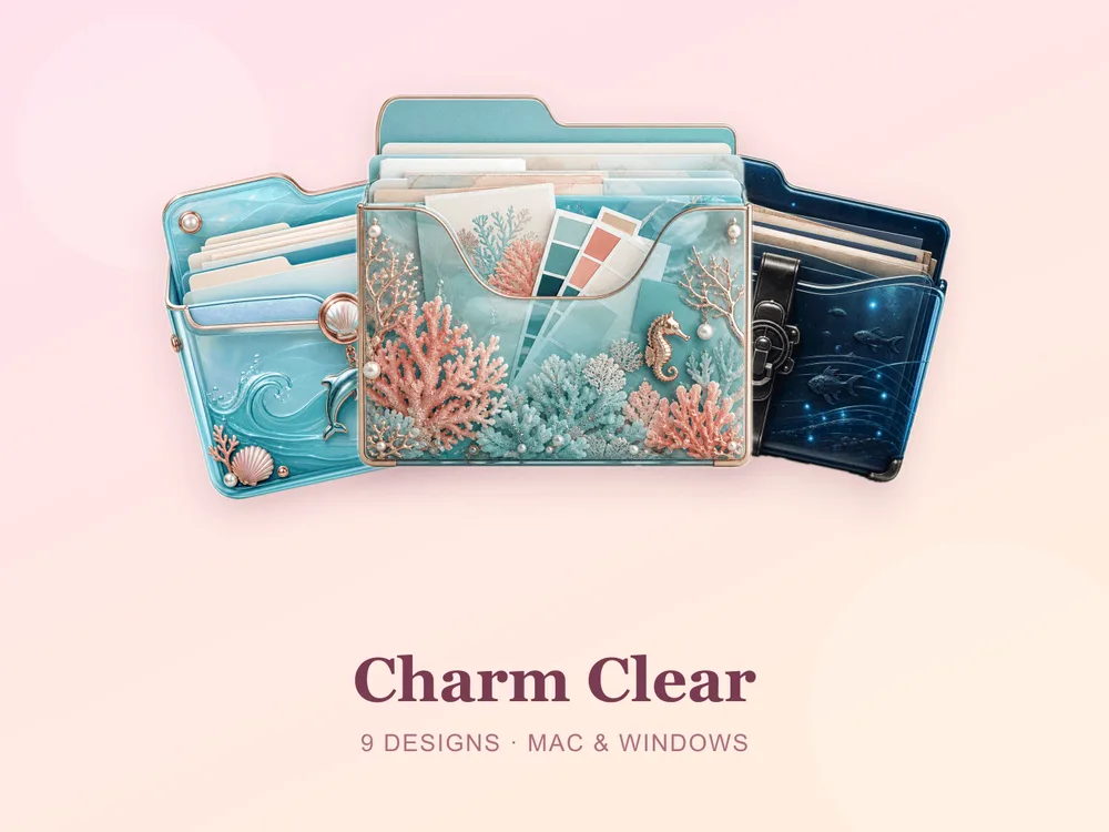
- Charm Clear — transparent folders with pinned charms; barely-there and perfect over a beige wallpaper.
Why a matching beige set beats single icons
Most "free beige folder icon" downloads disappoint because they're single PNGs from different designers — put a dozen on one desktop and the neutrals refuse to agree: one is pink-beige, one is grey-beige, one is nearly yellow, and the calm you were after turns into a muddy patchwork. Neutral palettes punish mismatches far more than bright ones do. Starting from one coherent set means every folder shares the same undertone and finish, so the whole screen reads as one designed, quiet surface from the first folder you change.
How to install them (60 seconds)
Once you've downloaded a set, applying it takes seconds:
- On Mac: Select a folder → press Cmd + I → drag the
.icnsfile onto the small icon in the top-left of the Get Info window. Full walkthrough: How to Change Folder Icons on Mac. - On Windows: Right-click the folder → Properties → Customize → Change Icon → pick the
.icofile. Full walkthrough: How to Change Folder Icons on Windows.
Want the new icons to turn into a genuinely tidy desktop? Follow our desktop organization guide.
Beige folder icons: quick FAQ
Are beige folder icons free? A few full sets on FolderIcons are free for every member (Kawaii Beauty, Coral Blush, Wild Print). The beige and cream sets above are premium — unlock them once with credits and own them forever, with no subscription and no expiry.
Will beige folders still be easy to tell apart? Yes, if the set is designed for it. The sets above vary the depth and the small motif on each folder, so they stay distinguishable at icon size — and you can still colour-code by position or name using our folder colour-coding guide.
Do they work on both Mac and Windows?
Yes. Every FolderIcons set ships .icns files for macOS and .ico/.png files for Windows, so the same neutral look applies on either system in about 60 seconds.
Will they stay sharp on Retina or 4K? Yes. The sets are rendered at high resolution (up to 1024px), so the fine texture and edges stay crisp on Retina and 4K displays.
Can I undo it later? Always. On Mac, open Get Info and press Cmd + X on the icon to revert; on Windows, use Change Icon → Restore Defaults. Your files are never touched — only the folder's picture changes.
The shortcut to a calm, neutral desktop
The fastest way to a desktop that finally feels quiet is to commit to one undertone and apply it across your most-used folders. Pick cool ivory, warm sand or caramel — just don't mix all three — and the whole screen instantly reads composed, expensive and restful.
Browse the full FolderIcons gallery — original, hand-crafted sets across every style above. Three skins are free for every member; unlock the neutral sets you love with credits and own them forever. No subscription, no expiry.
For more inspiration, see our minimalist & neutral folder icons and brown aesthetic folder icons.
Your folders, quiet at last.