Mint & Aqua Folder Icons for Mac & Windows (2026)
The best mint green and aqua folder icons for Mac and Windows in 2026 — fresh, cool-toned sets, hand-picked. With a 60-second install guide and FAQ.
Mint is the most underrated colour on a desktop. It reads as fresh rather than loud, it sits well on both light and dark wallpapers, and unlike the warm palettes everyone reaches for first, it does not make a screen feel heavier the longer you look at it. It is the green you can work in front of.
This is our hand-picked roundup of the best mint green and aqua folder icons for 2026 — cool, fresh and easy on the eyes. Every set is a complete, matching pack with .icns files for Mac and .ico/.png for Windows, so one clean palette carries across your whole desktop.
What makes a mint folder icon set look good
Mint has a narrow band where it works. Too pale and it turns into hospital green; too saturated and it goes fluorescent. The sets that get it right share three things:
- A hint of blue, not grey. Good mint leans toward aqua. The moment it drifts grey it stops feeling fresh and starts feeling washed out.
- A warm accent to push against. Mint on its own is cold. The best sets add a cream, a gold or a soft pink somewhere so the folders feel designed rather than clinical.
- Contrast that survives shrinking. Pale green on a pale wallpaper disappears. Good sets keep a darker outline or a defined subject so the folder still reads at icon size.
Best fresh mint sets
Clean, cool and straightforwardly minty:
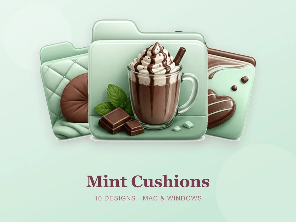
- Mint Cushions — a reading corner piled with mint cushions and throws; the rare cozy set that goes cool instead of amber.
- Ice Cream Truck — a mint truck with an oversized scoop and a striped awning; cheerful, and it stands well apart from the pink-and-yellow sweets crowd.
- Lime Juice — limes, glass flasks and zesty matcha pours; the sharpest green here and the most refreshing set in the library.


Best aqua & underwater sets
For mint that has drifted toward blue:
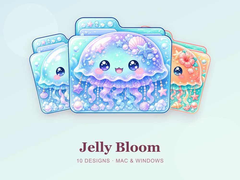
- Jelly Bloom — pastel jellyfish among bubbles, shells and pearls; slow, soft and quietly strange.
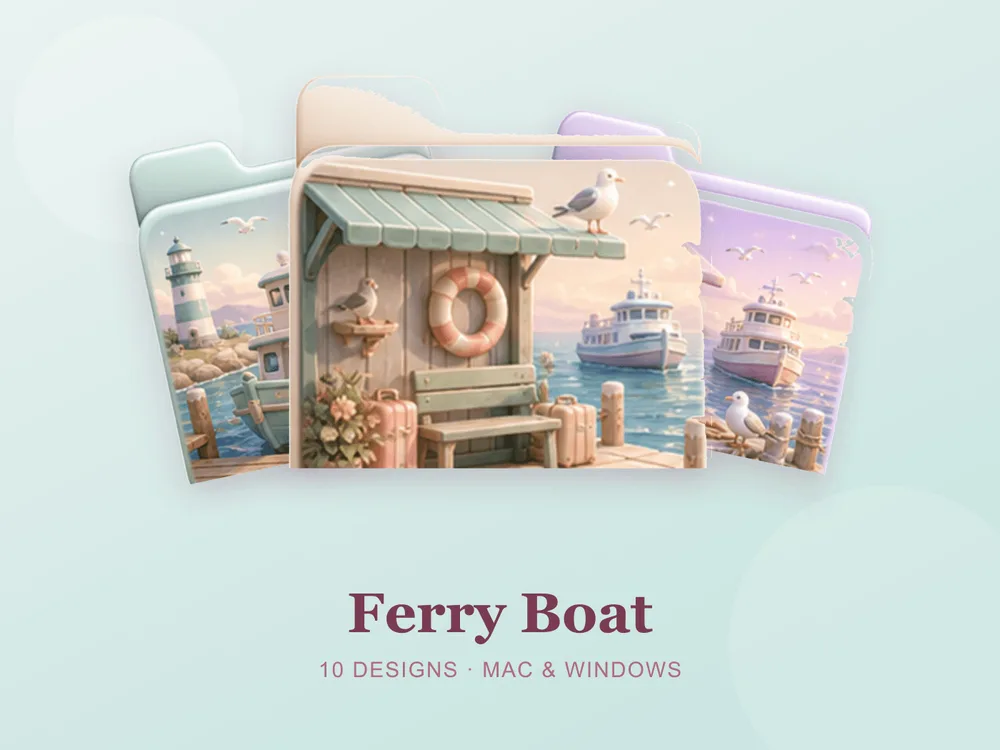
- Ferry Boat — a mint ferry docked by a lighthouse under a pale seaside sky; the calmest coastal set here.
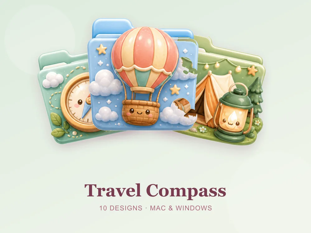
- Travel Compass — smiling compasses, map pins and clouds on fresh mint; the same job as a travel set, in a much better colour.
Best mint with a warm accent
Mint that has been given something to push against — usually the most wearable option:
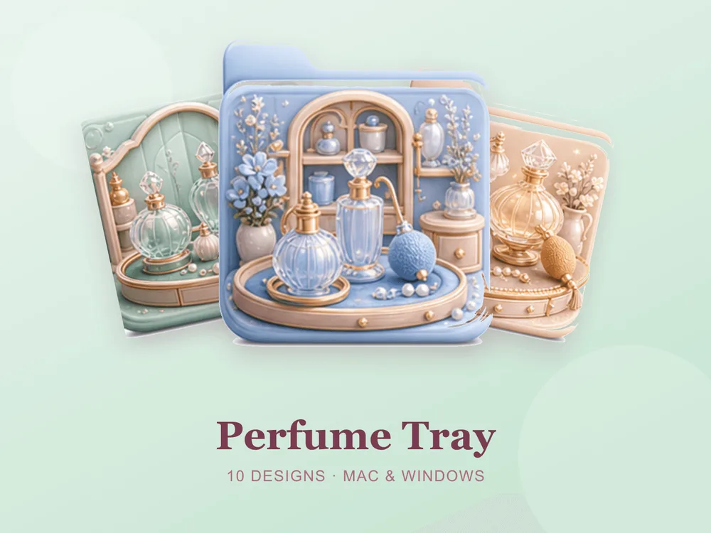
- Perfume Tray — glass perfume bottles and pearls on a mint vanity tray with gold; the mint cools the gold down, so it reads expensive rather than gaudy.
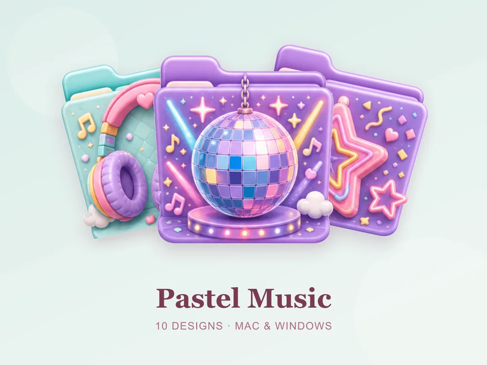
- Pastel Music — headphones with floating notes and hearts on soft mint; cheerful and specific, good for playlists and audio work.
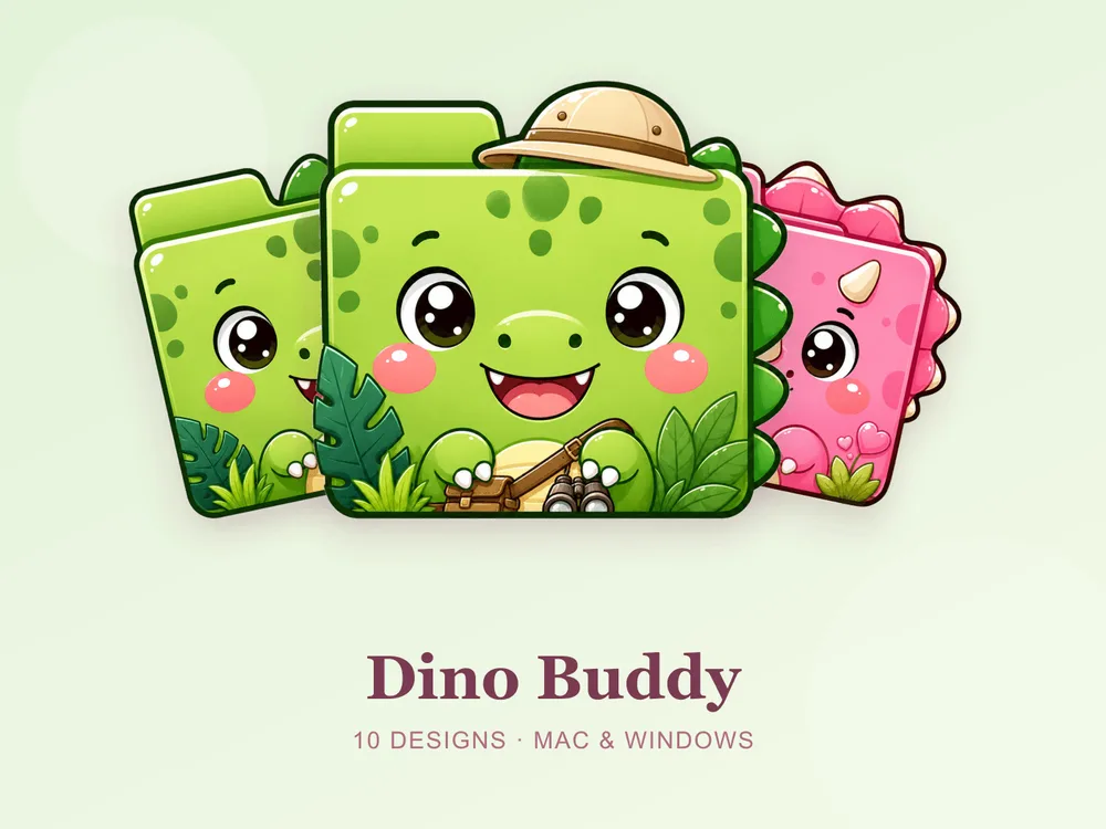
- Dino Buddy — a cartoon dinosaur in fresh leafy greens; chunky, friendly and calm enough that adults do not mind it.
Why a matching mint set beats single icons
Most "free mint folder icon" downloads disappoint because they're single PNGs from different designers — put a dozen on one desktop and one is a blue-mint, one is a yellow-mint, one is basically grey, and the freshness collapses into a muddy wash. Mint punishes mismatched undertones harder than a bold colour would, precisely because it is soft. Starting from one coherent set means every folder shares the same undertone and finish, so the whole screen reads as one clean, deliberate palette.
How to install them (60 seconds)
Once you've downloaded a set, applying it takes seconds:
- On Mac: Select a folder → press Cmd + I → drag the
.icnsfile onto the small icon in the top-left of the Get Info window. Full walkthrough: How to Change Folder Icons on Mac. - On Windows: Right-click the folder → Properties → Customize → Change Icon → pick the
.icofile. Full walkthrough: How to Change Folder Icons on Windows.
Want the new icons to turn into a genuinely tidy desktop? Follow our desktop organization guide.
Mint folder icons: quick FAQ
Are mint folder icons free? A few full sets on FolderIcons are free for every member (Kawaii Beauty, Coral Blush, Wild Print). The mint and aqua sets above are premium — unlock them once with credits and own them forever, with no subscription and no expiry.
How is mint different from the sage green sets? Sage is warm and earthy — olive, stone, plants. Mint is cool and leans toward aqua and water. If you want the earthier version, start with our green & sage folder icons.
Will pale mint folders still be easy to tell apart? Yes, if the set is designed for it. Every set above keeps a defined subject or a darker edge on each folder, so they stay legible at icon size instead of blurring into a pale wall.
Do they work on both Mac and Windows?
Yes. Every FolderIcons set ships .icns files for macOS and .ico/.png files for Windows, so the same palette applies on either system in about 60 seconds.
Can I undo it later? Always. On Mac, open Get Info and press Cmd + X on the icon to revert; on Windows, use Change Icon → Restore Defaults. Your files are never touched — only the folder's picture changes.
The shortcut to a fresh, cool desktop
The fastest way to make mint work is to commit to one undertone and stay there. Go clean and minty, drift toward aqua, or pick a set with a warm accent built in — then apply it across your most-used folders and let a plain wallpaper do the rest. The screen ends up feeling aired out rather than decorated.
Browse the full FolderIcons gallery — 217 original, hand-crafted sets across every style above. Three skins are free for every member; unlock the mint sets you love with credits and own them forever. No subscription, no expiry.
For more inspiration, see our green & sage folder icons and pastel folder icons.
Your folders, with the windows open.